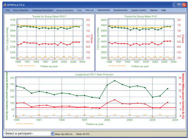
Fig. (2) SPIROLA chart. Upper part shows trends in group FEV1 and FVC means, for the predicted (yellow line), observed (green line) and
z-scores (red line) values, and bottom part shows absolute (green) and relative (red) pair-wise within-person variation sr or sp, by year.